My iOS Apps
Putta for the iPhone
Lotta! for the iPhone
Lotta! for the iPad
iOS Software
Auto Layout Demo
Motion Effects subclass
Table View Edit Pane
Mac OS Software
Lotto X
ListView
Classic Software
MacTravesty
Lotto
HyperCard Software
SkivBunt
MacTidingsNU » Sork Software » Auto Layout Demo
Updated 14-11-03
Putta Auto Layout Demo

The cat is out of bag and we now know that the new iPhone resolutions starts at a rather strange 1334 x 750 pixels which is 667 x 375 points, neither of which is a binary number.
Apple gave us the tool required for adaption to new screen sizes already in 2011 in the form of Auto Layout. This article outlines one way of doing this that worked very well with iOS 7.
Regrettably, iOS 8 breaks my Auto Layout code efter the player view transforms. According to Apple Developer, this is the way they think it should work. As a result, I have to correct the malplaced views manually, creating a rather ugly, and potentially fragile code. I will include a second (and a third) project with the updated code next to the original version.
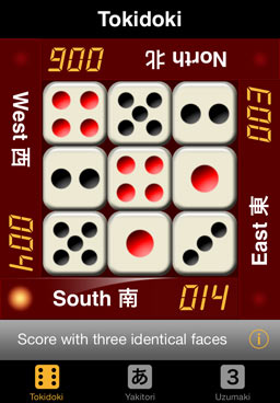 My little app Putta only received a minimal update for iOS 7, when planning a more thorough workover for the next version, I thought it would be wise to consider a possible iPhone 6 with a larger screen. The screen shot shows that it is the peripherial components that present challenges. Since the nine sliding buttons have a fixed size it is the surrounding player views that will have to adapt if the screen becomes wider. Something that should not be too difficult to do even if they use an ImageView for the background.
However, the fact that a template view is copied, translated, and rotated four times could conflict with Auto Layout. This possibility serves as an interesting challenge that motivated this tutorial. When starting the project, I had no idea if it would actually work. My hypothesis was that it should work if I added the constraints after laying out the views with their transforms. And so it did [in iOS 7]. Auto Layout is great when it works but can often be difficult to get right. Hopefully, my example can add a little insight to this new and potentially very useful technique.
Before we go any further, I would like to reiterate, the basic idea is not new, and it was not created by Apple. The original Cassowary algorithms were described by Borning and Badros at the University of Washington already in 1997. Their page has links to some very useful information from Apple, the Cocoa Autolayout release notes, the Auto Layout Guide, and the WWDC 2011 Cocoa Autolayout video. Please note that the official Apple name now is Auto Layout.
PlayerCentral
The four player bar views are subviews of their superview PlayerCentral that will also host the constraints that controls their final layout. In addition, it has four constraints that define the size and position of a central spacer view – the PlaceView (tinted yellow here for clarity). This will provide the central limits for the player views.
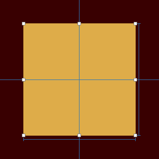
Constraints for width, height, and CenterX/Y of the PlaceView inside the PlayerCentral.
The player bars are created from a xib using loadNibNamed:, receive their proper transforms, and are then added to the PlayerCentral. The bars’ pertinent parameters are listed below (CCW from the bottom bar). The first set represents the original non auto layout code that includes a translation (shown at the top), in addition to the required rotations.
	CGAffineTransform translate = CGAffineTransformMakeTranslation(160.0, -113.0);

	frame = (0 273; 273 47);							tag = 0;
	frame = (273 47; 47 273);	transform = [0, -1, 1, 0, 160, -113];		tag = 1;
	frame = (47 0; 273 47);		transform = [-1, -0, 0, -1, 47, -273];		tag = 2;
	frame = (0 0; 47 273);		transform = [-0, 1, -1, -0, -113, -160];	tag = 3;
The auto layout constraints will make the same work as the translation, however, making this unnecessary. The second set shows how the translations have been included in the frames.
	frame = (0 273; 273 47);						tag = 0;
	frame = (113 160; 47 273);	transform = [0, -1, 1, 0, 0, 0];	tag = 1;
	frame = (0 273; 273 47);	transform = [-1, -0, 0, -1, 0, 0];	tag = 2;
	frame = (113 160; 47 273);	transform = [-0, 1, -1, -0, 0, 0];	tag = 3;
To prevent the creation of autoresizing constraints, translatesAutoresizingMaskIntoConstraints is set to NO in the PlayerView class. This has its own internal constraints added in IB, as shown below.

Please note that the yellow LED simulation at the left end of the bar that originally was a part of the background image now has its own ImageView, as this must move when the bar becomes wider. More about that later.
With the bars in place, the constraints are added while looping through the subview array, using the tags to identify the four player views. Here is how this looks for the bottom view (Player0):
                [self addConstraints:[NSLayoutConstraint
                                      constraintsWithVisualFormat:@"V:[Place][Player0]|"
                                      options:0
                                      metrics:nil
                                      views:views]];
                [self addConstraints:[NSLayoutConstraint
                                      constraintsWithVisualFormat:@"H:|[Player0][Player1]"
                                      options:0
                                      metrics:nil
                                      views:views]];
Using the visual format language makes it easy to see what is happening. The vertical constraints start from the central spacer to the first player view, a second constraint pins the player view to the bottom edge of the superview, that is PlayerCentral. Horisontally, the player view is pinned to the superview's right edge and then in its other end to the next vertical player view. The four added constraints look like this when logged:
	NSLAYOUTCONSTRAINT:0XA46F6C0 V:[PLACEVIEW:0X8E822A0]-(0)-[PLAYERVIEW:0X8E83FF0]
	NSLAYOUTCONSTRAINT:0XA46F710 V:[PLAYERVIEW:0X8E83FF0]-(0)-|   (NAMES: '|':PLAYERCENTRAL:0X8E81EF0 )
	NSLAYOUTCONSTRAINT:0XA4755C0 H:|-(0)-[PLAYERVIEW:0X8E83FF0]   (NAMES: '|':PLAYERCENTRAL:0X8E81EF0 )
	NSLAYOUTCONSTRAINT:0XA474B40 H:[PLAYERVIEW:0X8E83FF0]-(0)-[PLAYERVIEW:0XA474F30]
The demo game controller has an action method that changes the width of the PlayerCentral by manipulating its width constraint. How to find this? One way would have been to hook it up to an outlet in IB. Instead, we look it up by searching for a firstAttribute == NSLayoutAttributeWidth in the array of constraints and then toggling its constant. This triggers a layout recalculation by invoking setNeedsUpdateConstraints. Here is the proof in the pudding, all four player views have adapted to the new screen width of 396 pixels!
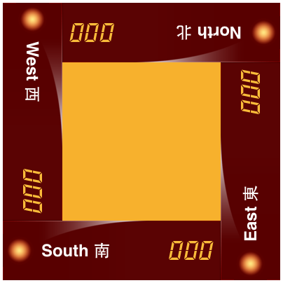
The player views have all expanded to fill out the larger space! Three things, the background image must expand correctly, the LEDs look awful, and why 396 pixels? Let’s address one thing at a time.
Xcode 5 offers a new way of making stretchable images with a Slicing feature in the Images.xcassets section. Although not exactly intuitive, with some experimentation you can easily do what otherwise would have required a good deal of code. Here is how this looks for my player view background:

All the stretching happens in the left side and at the bottom, leaving the top highlight mostly unchanged. The end caps outside the first and third lines are unchanged, while the thin pink part is replaced by the resizable area between the left and inner slicing handles. Use the Attributes inspector to specify wether the resizable area should stretch or tile.
The lamp (LED) view is constrained to a centerY position and stays in the middle of its superview. But it sticks to the left edge of the bar which looks bad. So it must be repositioned inwards by the same amount that moves the ImageView vertically. We do that by overriding the layoutSubviews method inside the PlayerView class implementation.
- (void)layoutSubviews {
    [super layoutSubviews];

    // Get the lamp view
    UIView *theLamp = self.playerIndicator;

    // And its new vertical offset
    CGFloat offset = theLamp.frame.origin.y;

    [UIView animateWithDuration:0.31 animations:^{
        // Animate the lamp view into the correct horizontal position
        self.lampLeading.constant = offset;

        [self layoutIfNeeded];
   }
   completion:^(BOOL finished){
    // Could be used to insert or remove a view
   }];
}
We must call super on this method and then gets the lamp offset from the image view Y origin. Here I have already prepared a property that is an outlet to the constraint that pins the lamp view to the player view left edge. The offset is applied to the constant of this constraint and the lamp is centered again after a call to layoutIfNeeded.
Just for the fun of it and to demonstrate how this is done the offset is applied with an animation. The completion block can be used to make changes to the view hierarchy, for example. That said, here is the finished layout:
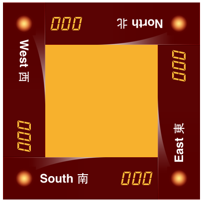
Since the Player label is constrained to the right edge of the lamp view, the label shrinks when the lamp moves to the right. To make the text move too, and not distort or clip, its Content Mode is set to Left.
So what about the strange number 396? Well, at least it is dividable with 4. Which makes it into a not entirely unreasonable screen width. But more importantly, this is what you get if you add another column of icons the the iPhone Springboard. Add another row too and you will get a height of 656 (also a multiple of 4).
Well, I was wrong about adding more icons, this would have made the screen more cluttered. The actual width should be 375 for the smaller 4.7 inch screen.
Version 1.1 also adds the large title graphic originally added for the 4 inch screen.
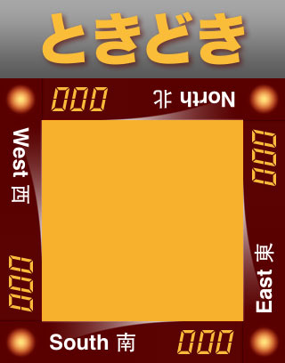
The following image shows the distorted views caused by the Auto Layout “bug” in iOS 8. I reported this in June, it still not fixed, and probably will not be. In addition, later betas introduced some very strange math were a simple 0 becomes weird numbers:
frame = (47 -4.9738e-14; 273 47); transform = [-1, 3.6739403974420594e-16, -3.6739403974420594e-16, -1, 0, 0];
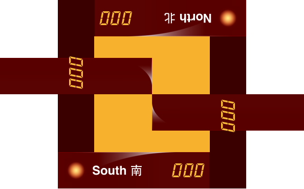
The new behavior in iOS 8 is that all layout is calculated with respect to the untransformed geometry. This will return the frames of my rotated views to thier unrotated state and mess up the view content.
My first solution (1.2) to this was twofold, add another lever of untransformed views with the correct size and position required by the rotated player views, and add the player views as subviews to the new container views. Regrettably, this was not enough, the distorted frames of the transformed views still had to be manually corrected to those of their containers. It was also neccessary to adjust the frames of the player view subviews, the background and the text. The container views were added to the Storyboard with constraints, of course.
The second and better solution (1.3) avoids the container views and just correct the player views and their content in their original positions. All corrections are applied in the player view layoutSubviews method. Some constraint changes were also required in the PlayerView.xib.
The demo code
You can download the demo project below and play with it in Xcode. Hopefully, there is something in it that will benefit your own efforts to conquer Auto Layout. As many other powerful concepts, this is not always that obvious and easy. For more, have a look at the book by Erica Sadun iOS Auto Layout Demystified. This can be ordered from Amazon.
Version list
Version 1.0 first release. Dec 2013.
Version 1.1 corrects the transforms to work with the iPad Retina and 64-bit simulators. It also adds the large title with constraints at the top. Apr 2014.
Version 1.1.1 adds a motion effect to the large title as demonstrated in the TextInMotion tutorial. Apr 2014.
Version 1.2 modifies the Auto Layout code with the corrections required by iOS 8. Nov 2014.
Version 1.3 is a simplified version for Auto Layout and iOS 8. Nov 2014.
Downloads
Xcode 5 project for the demo: PlayerAutolayout.zip (81 kB)
Modified project for iOS 8: PlayerAutolayout 1.2.zip (92 kB)
Simplified project for iOS 8: PlayerAutolayout 1.3.zip (101 kB)
E-mail your thoughts on the app to:
Putta is the simple game with a twist (or two).
