My iOS Apps
Putta for the iPhone
Lotta! for the iPhone
Lotta! for the iPad
iOS Software
Auto Layout Demo
Motion Effects subclass
Table View Edit Pane
Mac OS Software
Lotto X
ListView
Classic Software
MacTravesty
Lotto
HyperCard Software
SkivBunt
MacTidingsNU » Sork Software » Table View Settings Pane
Updated 14-02-19
Table View Settings Pane
Summary
Some sample code that shows how a settings pane can be animated down over a table view with the help of Auto Layout.
Introduction
 One of the many new features in iOS 7 is the table view inline picker. This makes a lot of sense when the table cell content is similar to that of the picker, such as the date and time. Apple offers the code example DateCell that shows how a date picker can be inserted dynamically in a cell. This is not simple, however, and not always practical. If the picker settings are not actually visible in the table, a different model might be a better way.
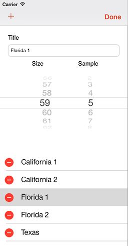
This code example will show a solution that offers a separate settings pane that slides down above a shrinking table view. What is inside the pane is entirely up to you, my example features a text field and a picker. The image to the right shows how this looks in the latest iPad version of my app Lotta.
The original version used a simple animation to add the settings pane, today it is best to use Auto Layout, as will be outlined in my tutorial with the somewhat simplistic name Example. I made this as an exercise in Auto Layout and added some made up code to make it into a functional app that might serve as the foundation for something actually useful. You can download the project below and play with it in Xcode.
My demo app was created from scratch, that is from the Master-Detail Application iPad template which was modified to allow the table view to shrink. The template Master View Controller (MVC) is a Table View Controller with a table view and that will not work. So it had to go and was replaced by a regular View Controller hooked up to the dangling outlets and relations of the storyboard. A table view was placed in the Master view and connected to the MVC. The Extend Edges were disabled as the table view should attach to the bottom of the Navigation Item which is the Top Layout Guide, a very useful item.
A set of constraints were added to the table view in IB, pinning its leading, trailing and bottom edges to the containing view. The top constraint pins to the TLG, as mentioned before, and this is also connected to the MVC outlet – tableViewTop. With the help of this, the top constraint can be replaced by the EditView and its constraints.
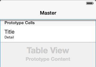
The image below shows the Master view with the new table view and the top constraint below the Nav bar. A prototype cell has received the Subtitle Style.

The Example code
An Edit button is added to the Nav bar. Invoking this puts the container view in an editable state with the help of the setEditing: method. This will call my showAccessoryView method that starts all the fun.
To begin with, the EditView is created from its own xib, if required. This accessory view has its own set of constraints, of course. The new view is added to the Master view.
Then its is time for Auto Layout shuffling. First the old top constraint is removed. Then a new set is added to pin the EditView between the table view top and the topLayoutGuide. This looks visually like this: @"V:[topGuide][editView][tableView]". The first constraint in this set is saved in the tableViewTop outlet. The constant of this top constraint is set to minus the height of the EditView. Another set of constraints are added to pin the sides of the EditView. After a call to layoutIfNeeded the constant is changed to zero in an animation block also calling layoutIfNeeded. This will animate the EditView into position while Auto Layout makes sure that the table view shrinks down to make room. The animation completion block is used to select the edited title and update the EditView content. All this takes a page worth of code so I will not show it here, go look in the project if you fancy the nitty gritty details.
When the user dismiss the editing a hideAccessoryView method will do almost the opposite of that mentioned above. The constant is animated to its minus value again, the EditView is discarded (with its constraints) and a new top constraint is inserted and connected to the outlet. Since this is shorter I can show it here :]
// Hide the edit view accessory with animation
- (void)hideAccessoryView
{
    // Get our top constraint again
    NSLayoutConstraint *topConstraint = self.tableViewTop;

    // Animate the removal of the edit view
    [UIView animateWithDuration:0.31 animations:^{
        // Move the edit view outside again
        topConstraint.constant = -accessoryHeight;

        [self.view layoutIfNeeded];}
        completion:^(BOOL finished) {
            // Remove the unwanted edit view and its constraints
            [self.editView removeFromSuperview];
        }];

    // Create and add a new top constraint for the table view
    id topGuide = self.topLayoutGuide;

    NSDictionary *views = @{@"topGuide" : topGuide, @"tableView" : self.tableView};

    NSArray *constraints = [NSLayoutConstraint
                            constraintsWithVisualFormat:@"V:|[tableView]"
                            options:0
                            metrics:nil
                            views:views];

    // Only one constraint in this set. Save it for later removal if required
    NSLayoutConstraint *newTopConstraint = [constraints firstObject];
    self.tableViewTop = newTopConstraint;

    [self.view addConstraints:constraints];
}
The result
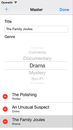
 Here is our fantastic movie list in edit mode. The title is editable and is coupled to a genre. New titles can be added and used flicks deleted. The chosen epic is also detailed in the Detail view (not shown here).
Version list
Version 1.0 first release. Feb 2014.
Downloads
Xcode 5 project for the edit demo: Example.zip (82 kB)
E-mail your thoughts on the app to:
Putta is the simple game with a twist (or two).
